You spend months hitting the pavement. You survive grueling long runs in the heat and endless early mornings. You finally cross that finish line at the Sydney Marathon, arms raised, gasping for air. Then, you look at your hard-earned medal and see a stadium that’s 10,000 miles away.
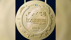
That is the current reality for organizers of the Sydney Marathon. Just one week out from the 2026 race, sharp-eyed runners noticed a glaring oversight on the participant medal. Instead of engraving the local Sydney Allianz Stadium, the design team apparently pulled an image of the Allianz Arena from Munich, Germany. In similar updates, we also covered: Dissecting The MLS Discipline Matrix Why Retrospective Fines Fail To Deter On Field Violence.
It’s an embarrassing mistake that highlights a bigger issue in mass-participation events: the distance between digital design and real-world execution.
The Cost of a Google Image Search
Most of us have used a quick web search to double-check a detail. Designers do it too. But when you’re tasked with capturing the essence of an iconic global event, "good enough" search results aren't enough. Sky Sports has analyzed this critical subject in extensive detail.
The speculation is that a designer simply searched for "Allianz Stadium" and grabbed the most visually striking option that appeared. The Munich venue, famous for its glowing, pillowy exterior and its role as a 2006 World Cup site, is arguably the most recognizable "Allianz" stadium on the planet. Sydney’s Allianz Stadium in Moore Park, while beloved by locals, simply doesn't have the same global search footprint.
When you rush the creative process, you lose the details that actually matter to the participants. For a race that fought hard to become the seventh Abbott World Marathon Major in 2024, these details are everything. Marathoners don't just pay for a run; they pay for a story. They want a piece of metal that proves they were in Sydney, not a souvenir that accidentally honors Bavaria.
Why Marathon Medals Are More Than Just Metal
If you’ve never run a marathon, it might be easy to dismiss this as a minor aesthetic gripe. But for the 40,000 runners expected on the course this August 30, it’s about pride.
A marathon medal is a physical ledger of a life-changing experience. When you look at your collection on the wall, each one acts as a specific geographic and emotional anchor. If you’ve done the work, you want the documentation to be perfect.
The Sydney design includes some genuinely thoughtful elements. It features a gold and indigo pattern by First Nations artist Ambrose Killian. It includes 42 blue dots on the outer ring to signify the 42.2km distance. These touches show that someone cared about the narrative of the race. That’s why the Munich stadium error is so jarring. It turns a piece of art into a "spot the difference" puzzle.
The Oversight Problem in Modern Events
This isn't just about a misplaced building on a metal disc. It’s a symptom of how quickly major sporting events are scaling.
Sydney was added to the World Marathon Majors circuit relatively recently. The pressure to deliver a "major" experience is enormous. With over 120,000 ballot entries for the event, the logistical load is massive. When teams are stretched thin, quality control is often the first thing to slip.
If you are involved in organizing any kind of event, take this as a warning. Your audience is smarter than you think. In the age of social media, thousands of "experts" are looking at your product with a magnifying glass.
- Verify your source material. If you are using imagery, go to the actual location. Don't rely on stock photos or the top result of a general search engine.
- Consult locals. If you are building a design that claims to represent a specific city, show it to people who live there. They will spot the difference between the Sydney Harbour Bridge and a generic bridge in seconds.
- Invest in the process. If you can’t afford to get the details right, don't include them at all. A minimalist design that is accurate is always better than a maximalist design that is factually wrong.
What Runners Should Expect Next
For those running next week, the medal is still coming. Organizers haven't announced a last-minute recall or redesign, and with the race days away, it's unlikely they’ll pull them all.
Honestly, the best way to handle this is to own it. It’s a funny, human mistake. It’s a talking point. Ten years from now, you’ll look at that medal and remember the year the Sydney Marathon accidentally went to Germany. It gives the 2026 medal a specific character that a perfectly accurate version never would have had.
Don't let a design flub ruin your race day. You didn't train for months to look at a piece of metal. You trained for the 42.2 kilometers. When you cross that line, grab your medal, ignore the stadium, and celebrate the fact that you actually finished. That’s the only part that really counts.